EN NL
Available now Say hi

Stichting Join Us

Join Us needed young people for Social Booster, its government-funded programme against loneliness. TikTok ads reached 200,000+ people, yet nobody new signed up. I compared its two recruitment routes, researched who to reach, and redesigned the sign-up page: from 0 to 20 sign-ups.

Ad views
203,613
Clicks
1,309
Sign-ups before
0
Sign-ups after
20

Old page → new page

2025

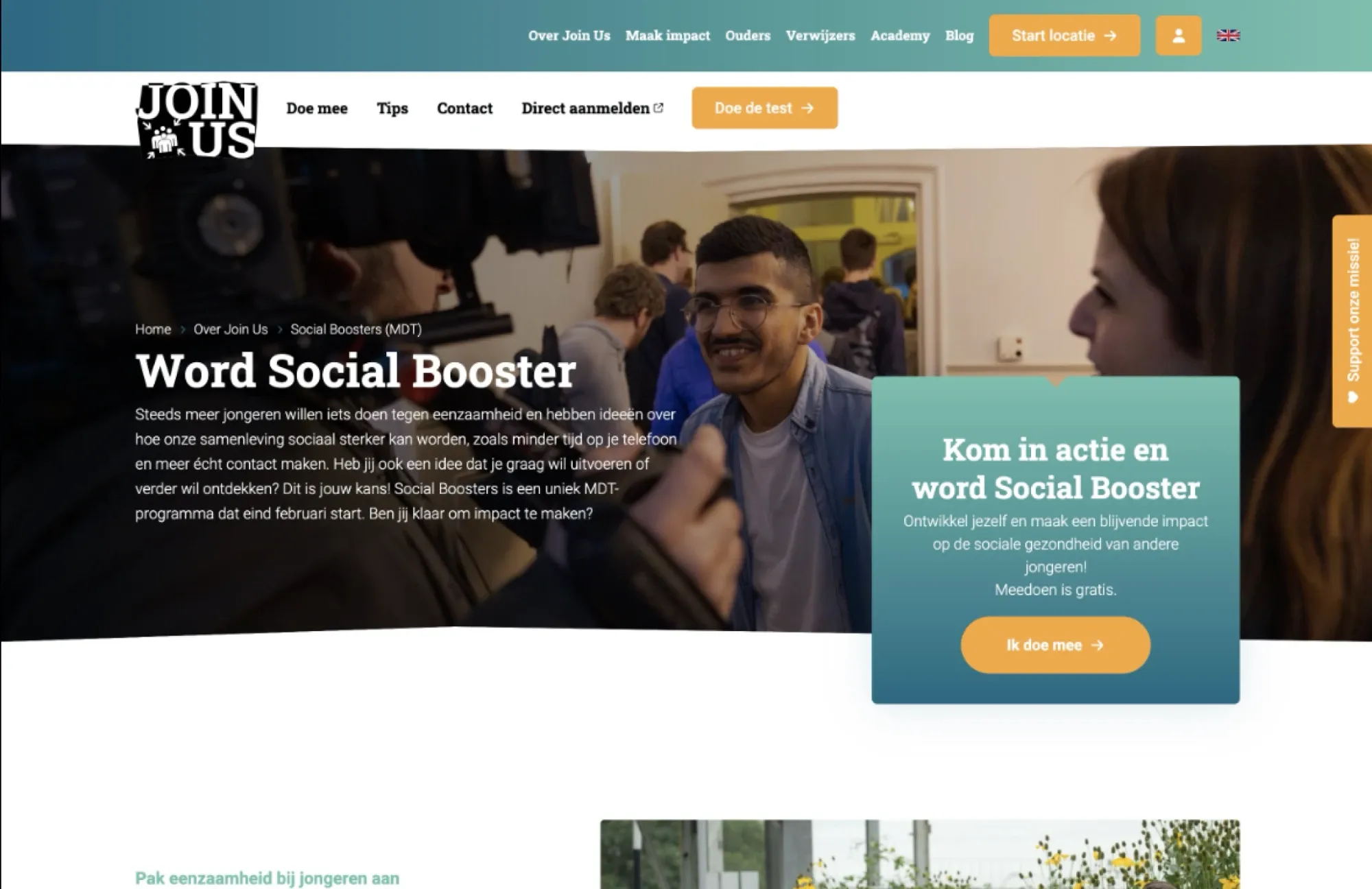
The old Social Booster page on the Join Us website: a dark photo header, “Word Social Booster” and a box with a button to the sign-up form
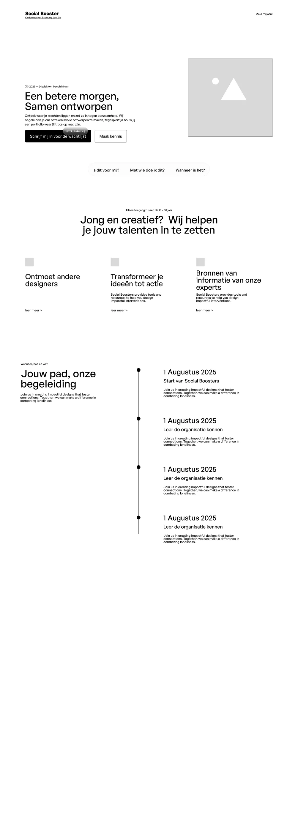
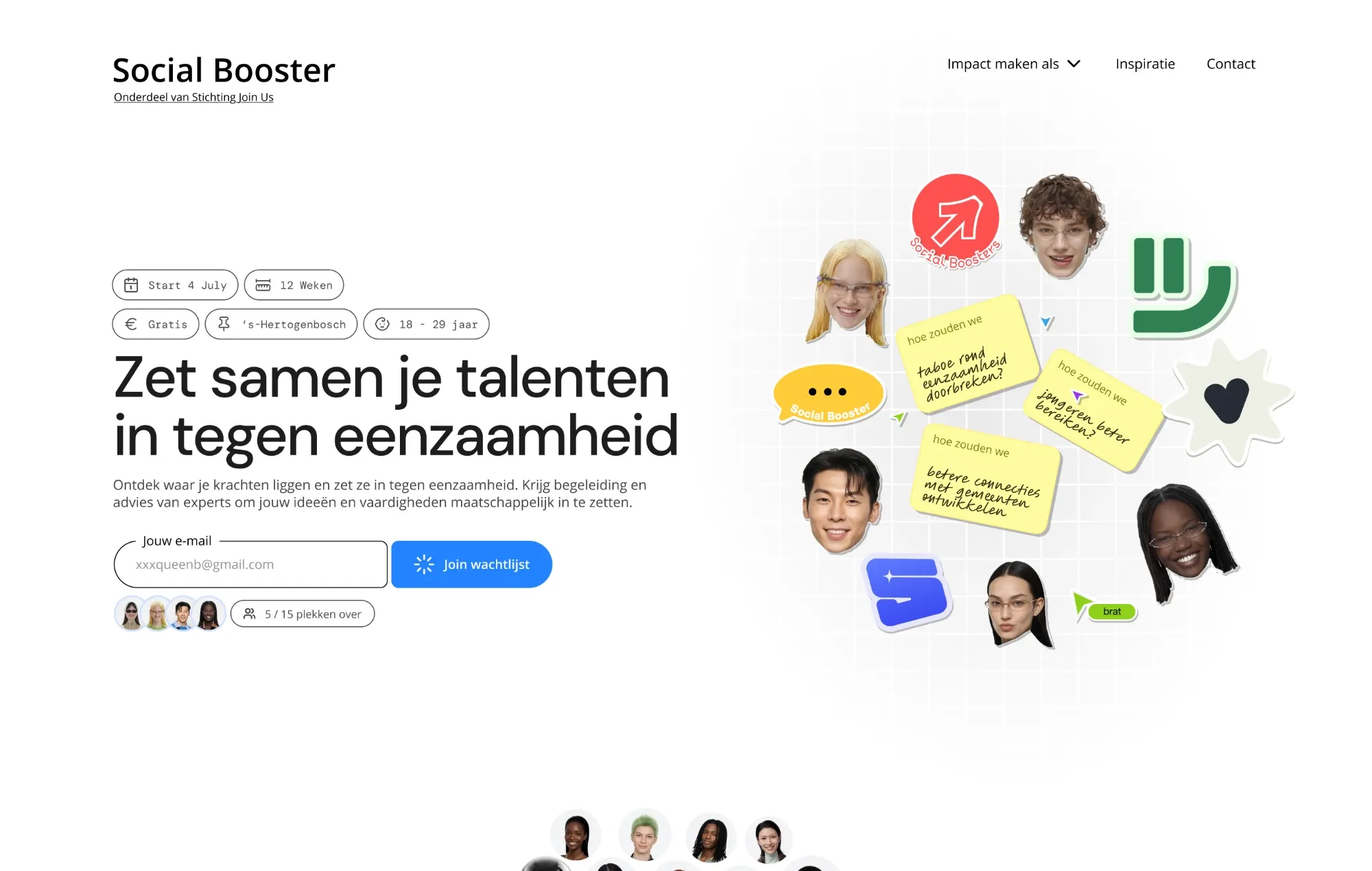
The new Social Booster page: “Zet samen je talenten in tegen eenzaamheid”, chips with start date, 12 weeks, free, ’s-Hertogenbosch and age 18–29, and an email field with “Join wachtlijst”
Sign-ups Before vs after
After 20
Before 0
XX likes · X comments

In short

The case in three steps

Each part keeps its colour further down the page, so you can jump straight to the one you need.

01 · The brief

Reach young people outside the usual group

Join Us asked me to recruit young people who want to make an impact, without their own experience of loneliness. Behind the question sat a hard target.

Social Booster coordinator Stichting Join Us · to Darryl The brief

Challenge | Social Boosters


The programme works well for young people who have felt lonely themselves. We also want to reach young people who want to make an impact without that experience. Our current channels don’t reach them.

Your assignment

  • Critical look What does our recruitment look like now, and what can we improve?
  • Audience analysis What drives them, and which channels reach them?
  • Advice and execution A concrete plan, and help to run it.
What was at stake

The grant needs 100 finishers a year

Dashed line: below 85 finishers the grant goes down. Solid line: the target.

  • Pays 75% of the costs
  • 60% paid up front
  • Runs 3 years

Source: MDT grant rules (VWS) and the coordinator. The 85 is my reading: 85% of the 100 planned places.

Comments

2
  • Employee Stichting Join Us "This fits the target group much better!"
  • Employee Stichting Join Us "Makes sense, smart approach!"

02 · Process

Three months, and not in a straight line

My project plan, in the three phases of the Behavioural Design Method. Each dashed line is a step I went back to, when the scope changed or the interviews showed something new.

  • Insight
  • Intervention
  • Impact
  • Went back to an earlier step
Approximate dates, from my project plan · 2025

Part 1 of 3

Where did it break?

Short answer

At the page. Open sign-up is the right route and the ad was in range: people clicked, then stopped.

03 · Recruitment data

Two ways in. One took a year, the other found nobody.

Join Us recruits through schools and through open sign-ups. I mapped both routes and measured how long it takes to find one Social Booster.

Route A

Through a school

Email a school, then wait for a whole class.

One school classSocial work, all one study (16 × 4) + 4 + 6 ≈ 72 Social Boostersin one batch

≈ 1 year of emails back and forth

  • One study only
  • The school picks the client for them
  • Depends on the school saying yes
Route B

Open sign-up

Ads and the website send people to one page. From there, you email the coordinator.

TikTok ad 0.64% clicked Homepage 1.51% clicked on LinkedIn, Instagram not shared Social Booster page758 words not
measured
Email the coordinatorwrite it yourself 0% 0 new sign-upsoutside Join Us
Who did join this way 5 former Join Us participants 0 others
  • Any study
  • They choose to join
  • Open all year
Time per Social Booster My own measure: time spent ÷ people who joined
Route A
≈ 5 days
1 year ÷ 72
Route B
∞
nobody new so far

04 · Literature

Open sign-up is the better route. It just didn’t convert.

I checked both routes against research on volunteer motivation and team performance.

What research says matters Route A · school Route B · open
Own choice Choosing your own role feeds intrinsic motivation. Deci & Ryan (self-determination theory) · Hackman & Oldham The school picks They pick
Mixed backgrounds Mixed teams come up with more usable ideas, up to a point. Ou, Goldschmidt & Erez (2023) · Van Zijl et al. (2023) One study Any study
Independent of schools A group can start without a year of emails first. Recruitment flow, Join Us Needs a yes Always open
People who joined What each route delivered so far. Join Us data ≈ 72 a year 0 new

So I focused on open sign-up

It wins on choice, mix and independence. The only thing it lost on was volume, and the data said why: people clicked, then stopped.

05 · Benchmarks

What works elsewhere: one ad, one page, one action

Before touching the design, I looked for recent ad-to-sign-up funnels with published results.

  • Girlguiding UK

    Charity · volunteers

    1. Google search ad
    2. Page only for signing up
    3. Sign up

    Reached people already searching, and sent every click to one page with one action.

    9 → 178 a month

    volunteer sign-ups, 2,139 in a year

  • Goodcall

    Software · sign-ups

    1. TikTok Spark Ad by a creator
    2. Page
    3. Sign up

    Ads that looked like a creator’s post, not an ad, with tight targeting.

    $185 → $7

    cost per sign-up, 96% lower

  • Nolan Bros

    E-commerce · sales

    1. TikTok in-feed ad
    2. Page that repeats the ad
    3. Buy

    The page repeated the ad’s message and images. Retargeting brought visitors back.

    1.2% → 3.4%

    clicked the ad → bought after the click

  • Join Us, before

    Non-profit · Social Boosters

    1. TikTok ad
    2. One long page · 758 words
    3. Write an email

    People clicked. The page lost them: 758 words and no way to sign up on it.

    0.64% → 0%

    clicked the ad → signed up

Join Us next to the benchmarks

The ad was in range. The page wasn’t.

Different platforms and goals, so not like for like. Sources: Torchbox (Girlguiding), TikTok for Business (Nolan Bros).

What I took from it

Leave the ads alone. Fix the page.

The click rate was within range of a strong commercial campaign. The drop happened after the click, so that is where the work went.

  • Continue the ad’s message on the page
  • Put the key facts first
  • Let people sign up on the page itself

Part 2 of 3

Who stopped, and why?

Short answer

Creative students who want a real case for their portfolio. The page asked too much of them, and the brand didn’t feel like theirs.

06 · Target group

Young people in four cities, within 30 minutes

Social Boosters meet at the office in ’s-Hertogenbosch. Research on travel time set the limit, and CBS data put the focus on cities.

Who I researched

One group, so the findings stay comparable

Locations
  • Utrecht
  • Tilburg
  • Eindhoven
  • Breda

Within 30 min by train of ’s-Hertogenbosch

Age
Up to 30 the MDT age limit
Own experience of loneliness
Not needed
Why one group
Similar travel, study and media habits
Audience definition Specific, on purpose
Specific1 million+ people live in these four citiesBroad

Within 30 minutes of the office

Four big cities, one train ride away

Schematic: distance from the centre = travel time by train. 1 million+ people live in these four cities.

How far volunteers will travel

About half an hour, one way

Source: NLvoorelkaar volunteer survey, 2019 (2,100+ people). Paid work: what people accept for a job.

07 · Interviews

Where people dropped off

Participants clicked a TikTok ad and used the page on their phone while I watched. The line shows where they dropped off, and the psychology behind each step.

  1. 01 Lands on the page Saw a TikTok ad, or was choosing an MDT programme.
  2. 02 Reads the page One long page with everything on it.
  3. 03 Decides if it fits Looks for reasons to join, or not.
  4. 04 Signs up by email The only way to join was to send an email.
  • Commitment bias They had already chosen to take a look.
  • Cognitive load 758 words on one page.
  • Social proofBandwagon effectAmbiguity aversion “I don’t know if this is for me.”
  • Choice overload “What should I write?”
Helps Barrier Opportunity Schematic: how keen people were at each step, from the site test and interviews.

Who signs up: creative students who need a real case

Four of my five interviewees looked like the same person. Her reason to join isn’t loneliness, it’s her portfolio.

Marijam K. 19 · Eindhoven · media design student 4 of 5 interviews

“Working on my future matters to me.”

Job to be done

Build her portfolio, so she has a better chance at a job in visual design.

Where to reach her

  • YouTube design tutorials
  • TikTok: creative feed, Adobe tips
  • International creators

Persona coded from my interviews. Name and details are a composite.

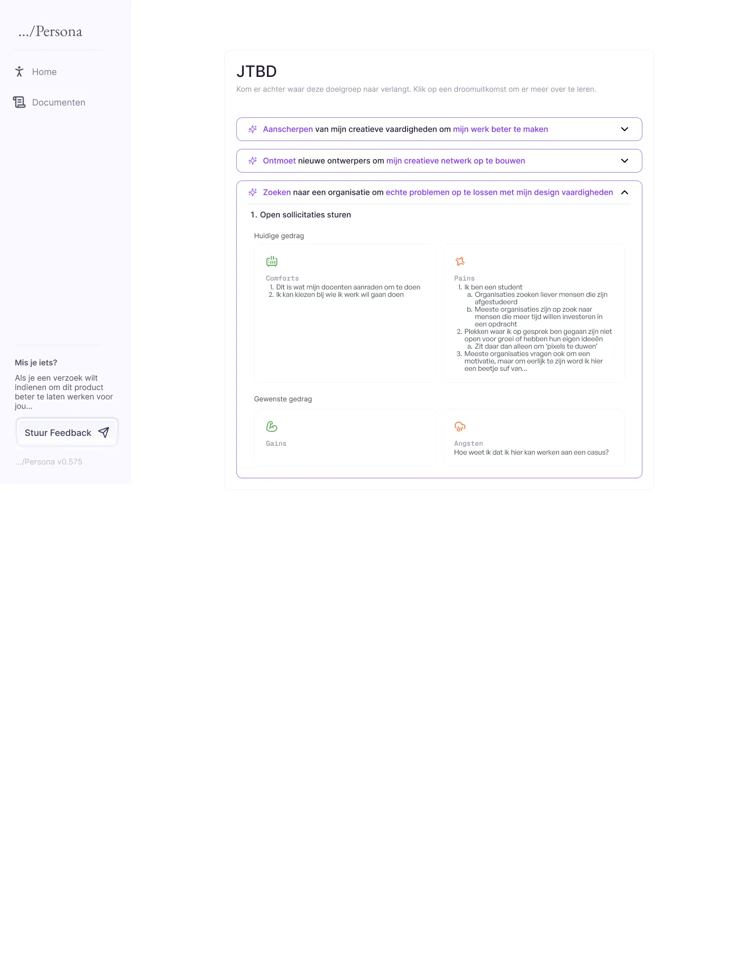
  • Pains Everyone at school has the same portfolio. Companies prefer graduates, and many only let students push pixels.
  • Gains A bigger network, team experience, and a real case to show.
  • Comforts After school I’d rather be with friends. And my teachers already tell me what to do.
  • Anxieties How do I know I’ll get to work on a real case here?
The persona dashboard I built for the comms team: a sidebar with Home and Documents, and the JTBD screen with three dream outcomes; the open one lists current behaviour as comforts and pains, and desired behaviour as gains and anxieties

Making the research usable

A persona dashboard for the comms team

Not everyone on the team knew qualitative coding. So I turned the coded interviews into a small tool: it opens on the main persona, and each dream outcome shows the forces behind it.

  • Version 1 gave each persona a third of the screen: too much scrolling
  • Renamed jargon like “JTBD” after the first team session

08 · Survey

The cause felt right. The brand didn’t feel cool.

Next to the usability barriers, interviewees judged the brand itself: would they want to be seen joining this? Before redesigning, I checked that in a larger group with a survey on brand coolness.

First impressions

Now that you’ve seen and used the website, what’s your first impression?

My question, after the site test

Answers from the interviews, translated from Dutch. The tags are my coding against the brand coolness scale.

  • “I’d fall asleep, a hundred percent.”
    Low on exciting
  • “Am I even allowed to be creative here?”
    Low on subcultural
  • “Looks like I’d have to put my creative energy in airplane mode.”
    Low on exciting
  • “Giving corporate.”
    Low on subcultural
  • “Reminds me of when data analytics came to the careers fair to recruit students.”
    Low on aesthetic appeal
  • “Did your web designer used to be a tax adviser?”
    Low on aesthetic appeal

Brand coolness of Join Us

The cause scores high. The look doesn’t.

Survey sent to ± 350 people, 200 responded · brand coolness scale (Warren et al., 2019) · share of the maximum score

What it means for recruiting

People join a brand, not only a cause

For a creative student, a programme is also something to show. Join Us passed on meaning and failed on look and feel. So the redesign had to raise desirability without losing the mission.

  • Keep: original and authentic, the mission
  • Raise: exciting, aesthetic and subcultural, the look

Part 3 of 3

What changed, and did it work?

Short answer

Three changes for one target group: sign up on the page, content for creative students and a brand of its own. Sign-ups went from 0 to 20.

09 · Strategy

Five opportunities, scored before I designed anything

I scored every opportunity on impact, effort and confidence. Normally I test one at a time. With one intake a year, I built the three that serve one target group together: creative students.

My ICE scores

Three fit one target group, so I built those together

OpportunityImpactEffortConfidence
Shorter time to sign up On the live page 6 2 10
Content for one target group On the live page 10 5 9
New visual identity On the live page 9 6 10
Personalised ad targeting Not in this round 8 8 9
Better TikTok ad performance Not in this round 8 10 5

Scores 1–10. Effort: higher means more work. Bubble size shows confidence; filled bubbles were built.

10 · Design

Old page vs new page

The old page asked people to read 758 words and send an email to sign up. Here is the top of both pages. The full new page is available on request.

Before
758 words, sign up by email
After
Key facts up front, sign up on the page
Result
0 → 20 sign-ups
Before Old page · hero
Top of the old Social Booster page on the Join Us website: a dark photo header with “Word Social Booster”, a long intro text and a box with an “Ik doe mee” button
After New page · hero
Top of the new Social Booster page: “Zet samen je talenten in tegen eenzaamheid”, key facts as chips, an email field with “Join wachtlijst” and illustrated faces with notes

11 · Iterations

Every barrier got a fix

I matched each barrier from the interviews to one change on the page, and went from lo-fi to hi-fi in eight versions. Each pin is one barrier and its fix.

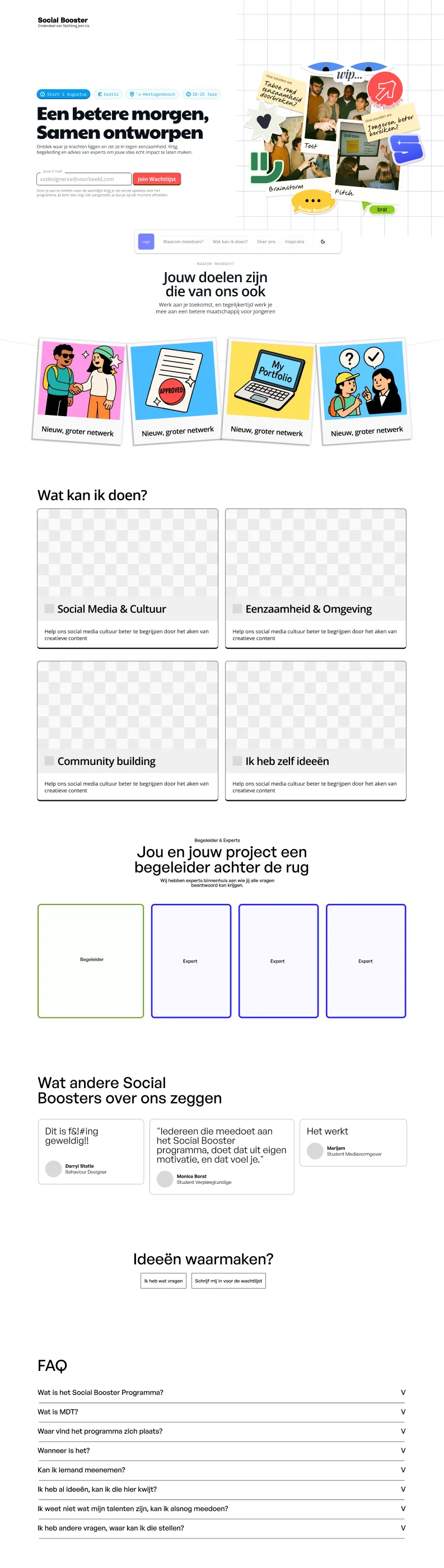
The new Social Booster page (Home v0.45), top part: hero with key facts and the waitlist field, “Wat anderen hebben ontworpen” with photos, the roles to pick from, the three-step programme, stories and the coaches
  1. “Giving corporate.” A brand of its own for Social Booster, separate from the Join Us look.
  2. 758 words on one page Key facts as chips at the top: start date, 12 weeks, free, location and age.
  3. “What should I write?” An email field on the page: join the waitlist, nothing to write.
  4. “I don’t know if this is for me.” Reviews from former Social Boosters, and how many places are left.
  5. “I’d fall asleep, a hundred percent.” What others designed, right under the first screen: photos and stories from earlier groups.
  6. “I can’t picture what it is.” Roles to pick from, like creative, event manager or researcher.
  7. “I don’t know what they expect of me.” A timeline of the programme: what happens when, and who guides you.
  8. “I don’t know who my mentor is.” The coach and the experts on the page, with names and faces.
  • Lo-fi version 0.1 of the sign-up page in grey: headline, key facts, a waitlist field and an image placeholder v0.1 · lo-fi Key facts and a waitlist field in the first screen.
  • Mid-fi version 0.5: headline, a blue waitlist button and sticky-note shapes on a grid v0.5 · mid-fi Built within the CRM’s limits, so it could be tested fast.
  • Hi-fi version 0.8 in the Join Us style: headline, a waitlist field and a collage of photos v0.8 · hi-fi Roles, coaches, reviews and FAQ, in the Join Us style.
  • The final design, Home v0.45: the Social Booster page with its own brand Home v0.45 · final design A Social Booster brand of its own, made to score higher on exciting, aesthetic and subcultural. This is the new page above.

12 · Learnings

What I learned

  • Interest wasn’t the problem: 1,309 people clicked. The route only broke at the last step, an email nobody wrote.

  • A good cause isn’t enough to recruit. Creative students judged the programme like a brand they would put their name to.

  • Research helps only if the team can use it. A persona dashboard made my interview codes usable for the comms team.

Result

From 0 to 20 sign-ups. The cost per sign-up is now the total spend divided by 20, where before nobody signed up at all.

More work

More case studies

All case studies

Have a brief? Let's talk.

Available for freelance work now. Remote, or on-site anywhere in the Netherlands.