LAPAS
Garden firms lose hours on requests that never fit. I designed and built a six-question request flow that tells them the budget, the garden and the wishes before the first call.
Questions 6
Live in 5 days
Developers 0
A visual identity for the Tilburg Culture Awards, which put Tilburg's makers in the spotlight. I designed the logo, type, colours and a poster system, and captured it all in a brand book.
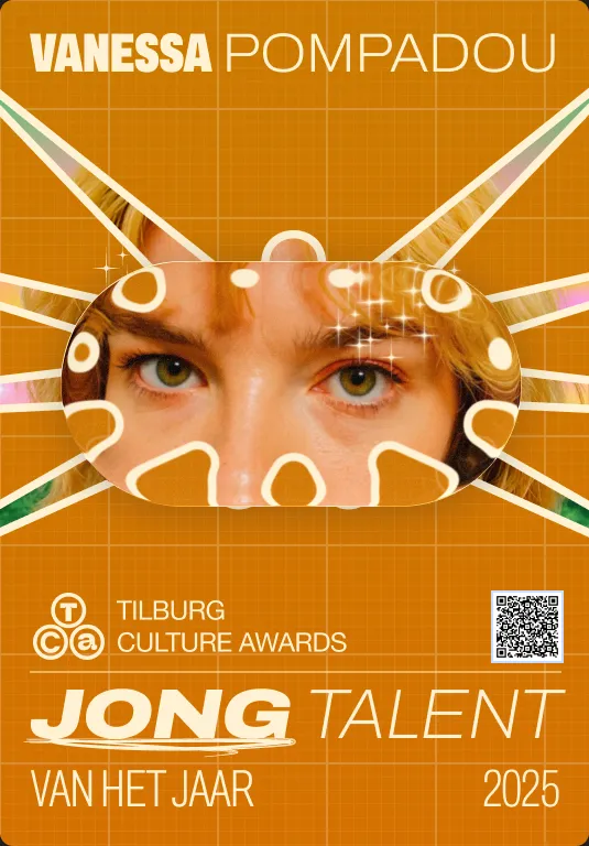
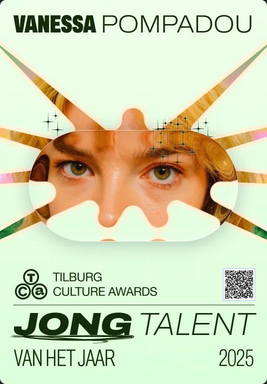
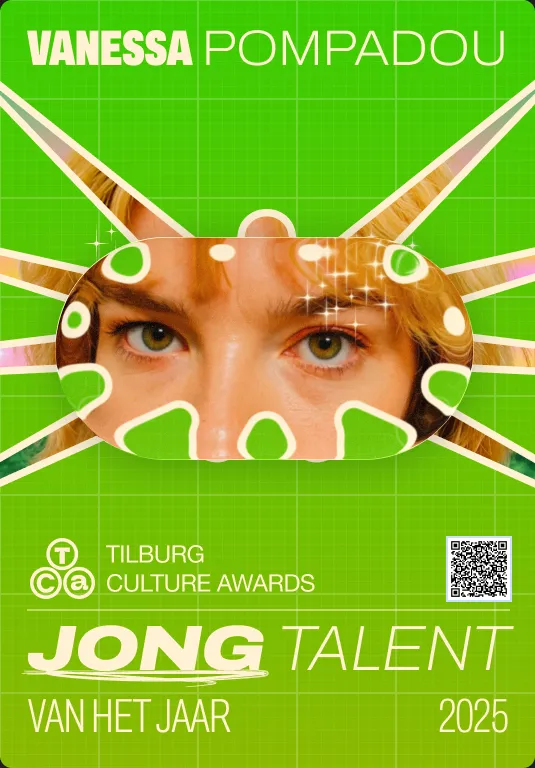
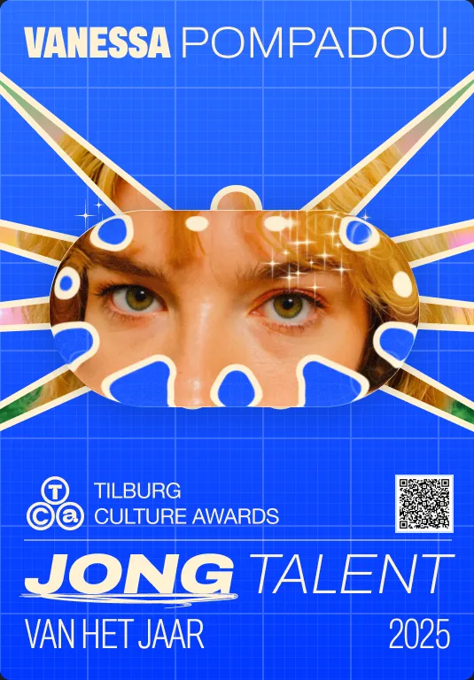
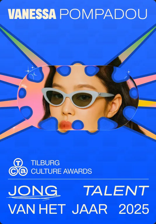
Brand book v0.75 · 2025
25.09.2025
01 · Context
The Tilburg Culture Awards celebrate makers in Tilburg, from design and photography to music, film and nightlife. The event is an award show by day and a party by night.
The identity had to put the nominees first, not the organisation, and stay flexible enough for posters, social posts and the event itself.
02 · Process
Brief
An identity that puts the nominees in the spotlight, not the organisation.
Exploration
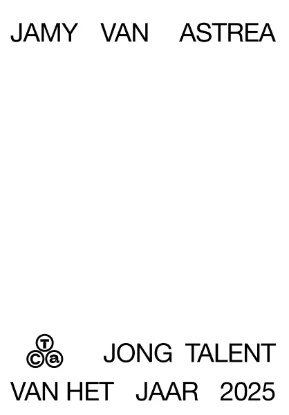
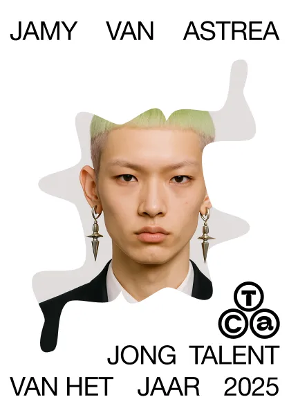
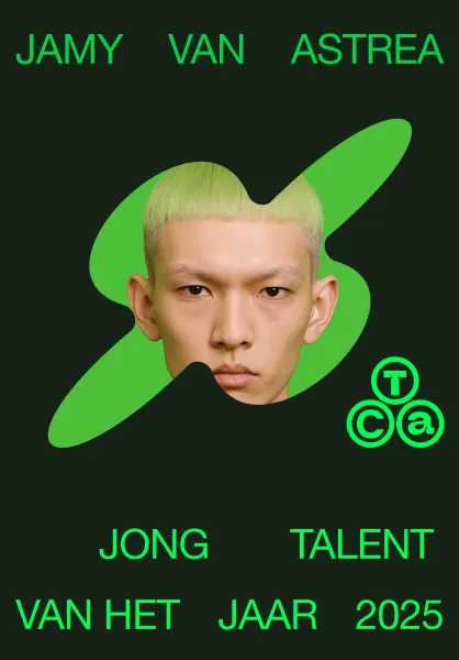
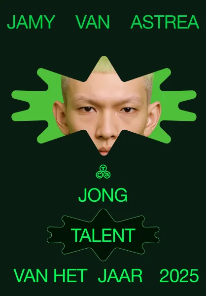
Started with type-only posters, then tried faces, cut-outs and star shapes in a colour per nominee.
Design
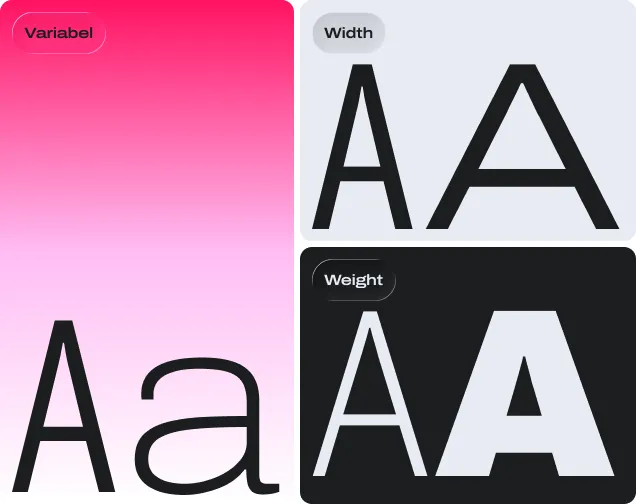
Logo in two versions, Archivo Variable, two backgrounds, three gradients, stars and scribbles.
Brand book
Posters, Instagram stories and templates, all captured in a brand book.
03 · Exploration
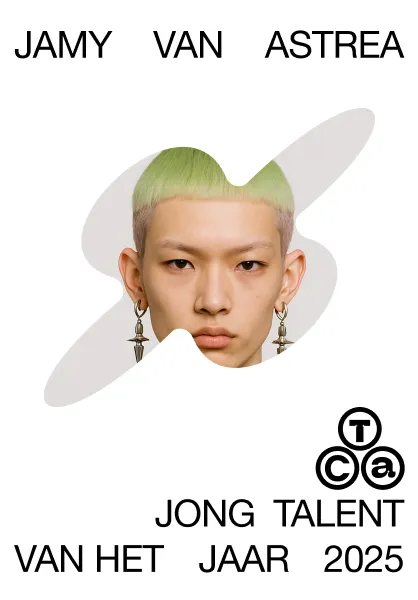
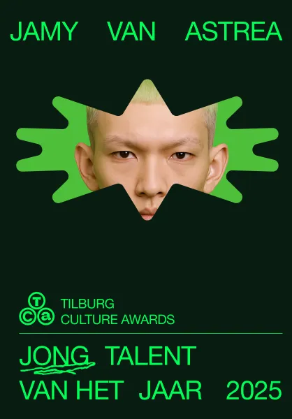
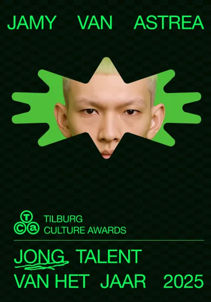
Seven steps from the first sketch to the final poster. No research here, just making, comparing and choosing.
04 · In use
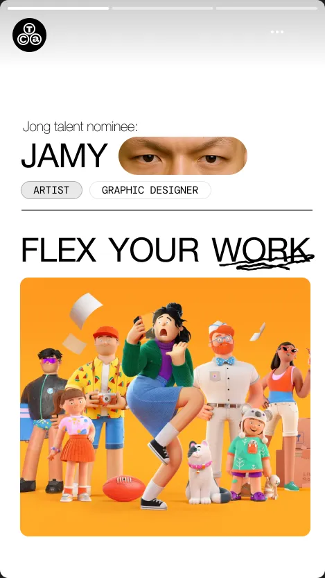
Same grid, same type, a different colour and star for each nominee. On Instagram the same system runs as stories and posts.
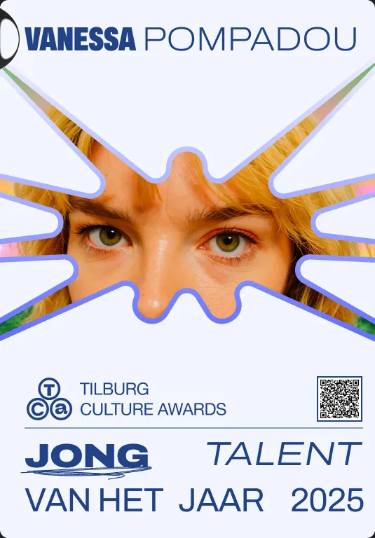
Stories introduce each nominee; the feed shows the full poster series.
05 · Brand book
Everything is captured in a brand book, so the organisation can keep making posters without me.

06 · Learnings
A few clear rules (a star, the eyes, one colour per nominee) turn one poster into a whole series.
One variable typeface gives the range of several fonts, while the identity stays recognisable.
More work
Garden firms lose hours on requests that never fit. I designed and built a six-question request flow that tells them the budget, the garden and the wishes before the first call.
Nobody signed up after 200,000+ ad views. I found out why and redesigned the page: from 0 to 20 sign-ups.
Available for freelance work now. Remote, or on-site anywhere in the Netherlands.